Brand identity · Design work

Lash Lover

A memorable identity direction designed to feel confident, elegant, and practical across customer-facing beauty applications.

  • Beauty & Cosmetics
  • Brand Identity System
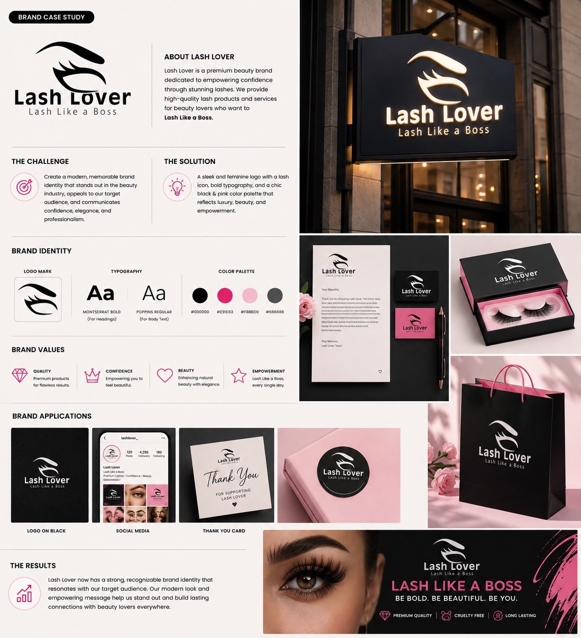
Lash Lover brand identity case study showing the lash logo, black-and-pink palette, packaging, storefront sign, social profile, and customer collateral. Brand identity · Design work

Overview

Lash Lover

Lash Lover is a beauty brand centered on lash products and services. The identity work connects a distinctive lash symbol with a direct wordmark and a coordinated visual system for packaging, retail, social, and customer collateral.

Challenge / context

The requirement behind the work.

The brand needed a clear identity that could stand apart within the beauty category while remaining recognizable across small packaging, social profiles, storefront signage, and printed applications.

Approach

How it was shaped.

The system uses a bold lash symbol, black-led typography, and selective pink accents to balance confidence, beauty, and practical legibility.

  • Distinctive lash symbol
  • Black and pink palette
  • Bold heading typography
  • Flexible retail and social applications

What was built

The practical parts of the work.

  • 01
    Logo System

    A primary identity combining the lash mark, wordmark, and supporting tagline.

  • 02
    Color & Typography

    A coordinated black, pink, blush, and grey palette with defined type styles.

  • 03
    Packaging & Retail

    Product-box, shopping-bag, label, and storefront-sign applications.

  • 04
    Customer & Social Collateral

    Social profile, thank-you card, stationery, and promotional-banner presentations.

Services / technologies

Capabilities connected in this work.

Services

Visuals

Selected views from the work.

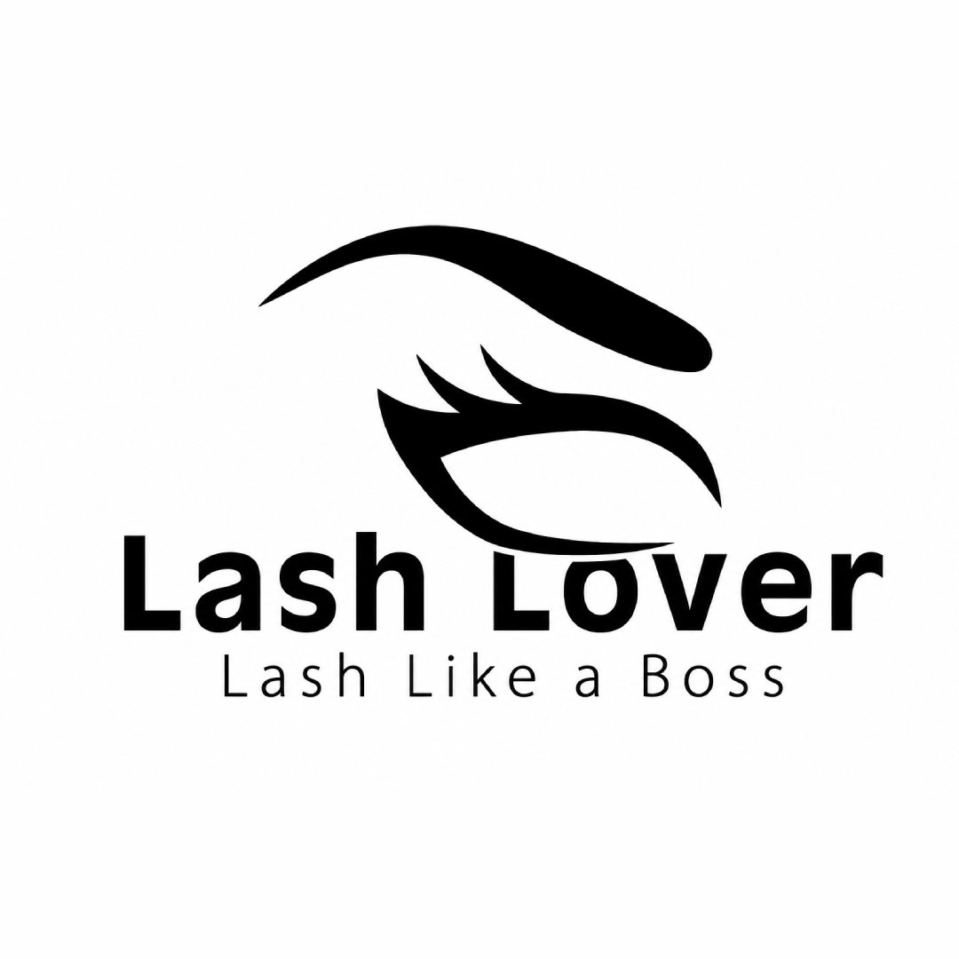
Lash Lover primary black logo with the Lash Like a Boss tagline.

Outcome

What the work now supports.

A coordinated identity system prepared for packaging, storefront, social-media, promotional, and customer-facing applications.

Related work

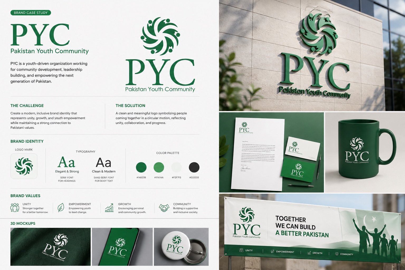
PYC brand identity case study showing the logo system, green palette, stationery, merchandise, signage, and campaign banner. Brand identity

Community & Youth Organization

PYC — Pakistan Youth Community

A community-focused visual identity designed around unity, youth empowerment, growth, and a clear organizational presence.

  • Graphic Design & Branding
  • Logo Design
  • Visual Identity
  • Brand Applications
View project
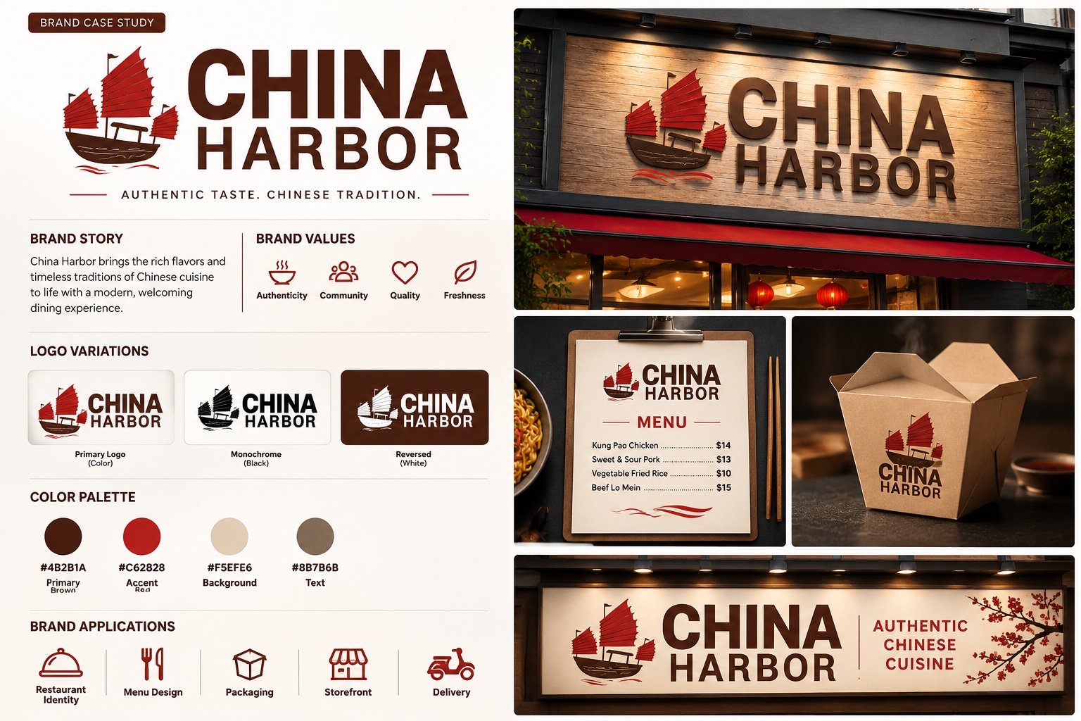
China Harbor brand identity case study showing logo variations, color palette, menu, takeaway packaging, and restaurant signage. Brand identity

Restaurant & Hospitality

China Harbor

A restaurant identity combining a traditional harbor-junk motif with a warm brown, red, and neutral application system.

  • Graphic Design & Branding
  • Logo Design
  • Visual Identity
  • Hospitality Applications
View project

Discuss your project

Have a similar project in mind?

Share the objective, what already exists, and where the current experience is creating friction.

Discuss your project